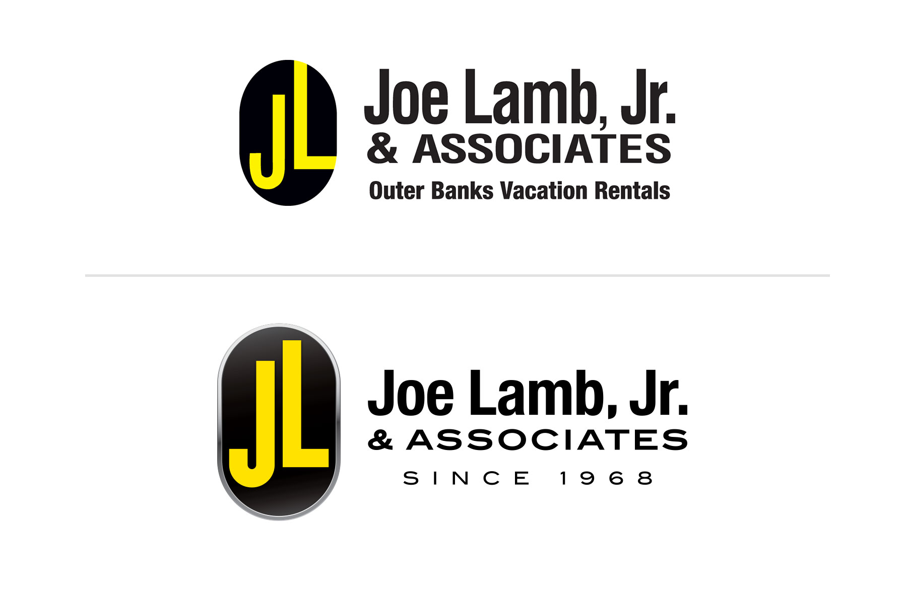
Joe Lamb, Jr. & Associates had used various print and production vendors in the past, which resulted in a lot of variation for the brand. The company's own logo was inconsistent across media and signage. In updating their logo, we kept the familiar pill shape and "JL" monogram (top), but with added details, textures, and a more thought-out type treatment (bottom).

Joe Lamb Jr. & Associates

Logo Design & Branding

Print and Digital marketing
One of the core values of Joe Lamb, Jr. & Associates is for their clients to feel like part of a family. We've created engaging advertising that builds on this concept and integrates signature visual elements of the brand. The company's yellow and black colors are well known all over the beach and are reinforced in both print and digital advertising campaigns.

Customer collateral
Relating important information to customers can be a difficult task when those customers want to get out on the beach as quickly as possible. We have worked with Joe Lamb, Jr. & Associates to design and print collateral pieces that are informative and topical.

Signage
When Joe Lamb, Jr. & Associates wanted to update their signature yellow and black property signs, we gave them a product that was affordable and on-brand. The company's previous signs relied on a painstaking process of hand-applying the number codes for each home. By producing the signs digitally, we offered a flexible solution that allows for plenty of one-offs as well as large orders.

Vehicle graphics
A company's brand extends into many different areas, and vehicles are often one of the most important. We designed and installed eye-catching graphics on vans for Joe Lamb, Jr. & Associates, turning them into rolling billboards for the company.
